
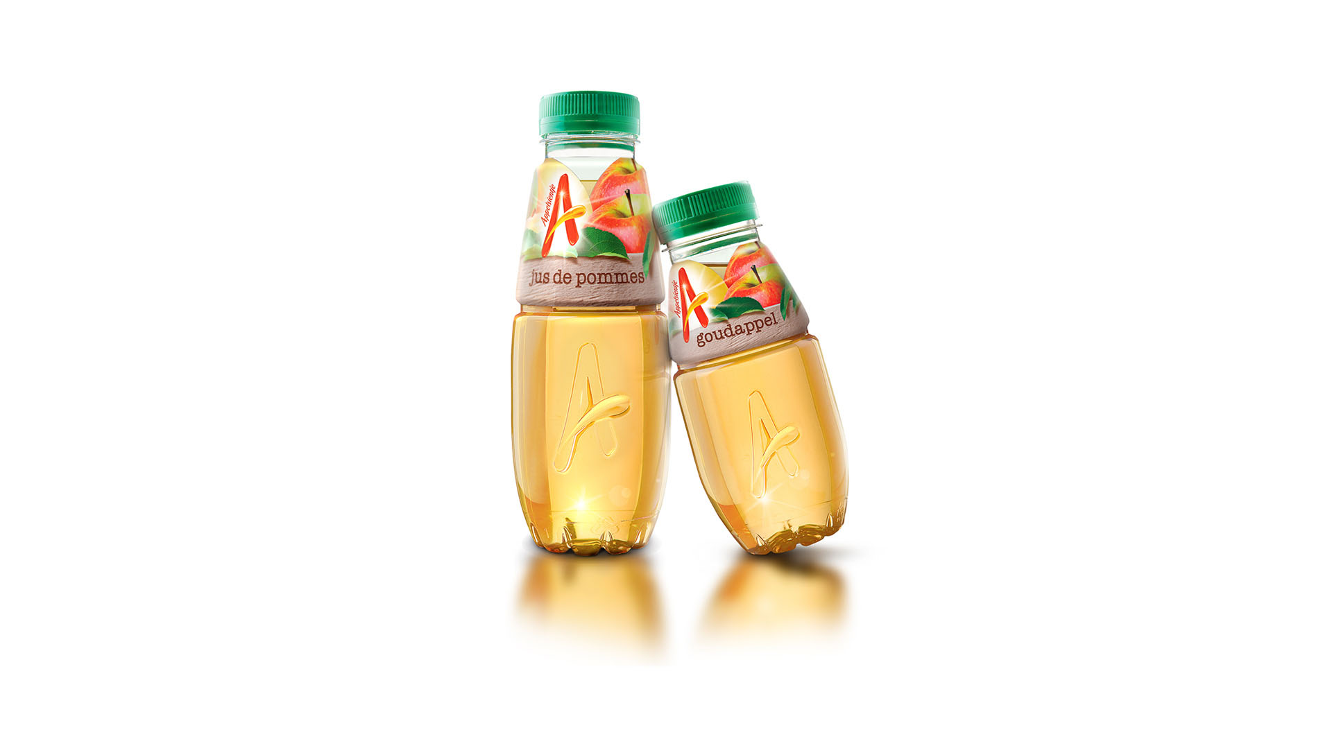
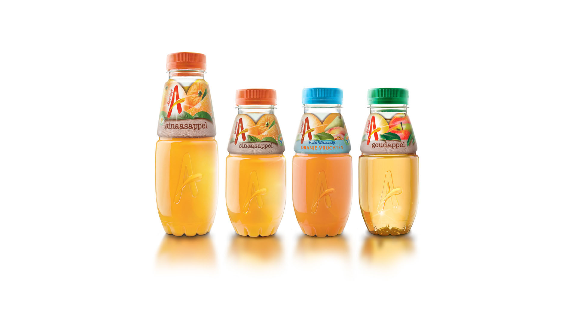
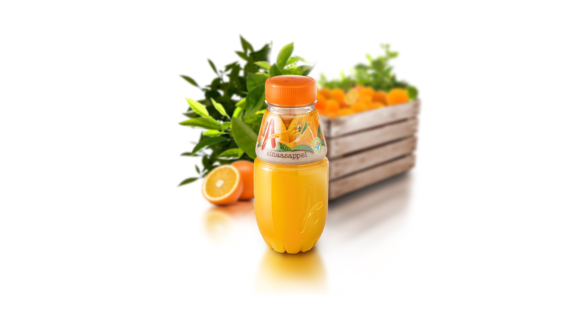
a pure, natural, fresh bottle design that shows it's all about the Appelsientje juice!


APPELSIENTJE Juice Bottle
Amidst the jungle of bottle shapes, and clutter of labels you see in supermarkets or out-of-home stores, creating a bottle that counters that trend and stands out becáuse of it's simplicity and readability, while emphasising the natural essence of fruit juices.
The smooth shape, as if it was directly formed out of a drop of freshly squeezed fruit, almost bursting from the juice, fits perfectly in the palm of your hand, ideal for enjoying Appelsientje while on the go.
The label, wraps the bottle's shoulders in the juice's origin, brand, and flavour descriptions. Combined with the complete transparancy of the, full body, the juice variants show.
Connecting with Appelientje as a finishing touch, the structural branding of the Appelstientje A, functions as a quality stamp, enriching the surface, and offering a playful tactile experience.
Design of bottle & Structural label: Sikko Valk
Project Manager: Sven van Westreenen
Brand: Friesland Campina, Appelsientje
2D label graphic design: Anthem
Creation: 2011
Released/To market: 2012
Designed while employed by

For more information about this project, please contact FLEX/Design.
a pure, natural, fresh bottle design that shows it's all about the Appelsientje juice!
